
Creating Clarity: The Importance of Proper Spacing in Your Glossary — WordPress Tooltips Pro Plus 34.4.8
Hi, dear users of WordPress Tooltips plugin, I hop this message finds that you are doing well and having wonderful days with your family We received a ticket from a WordPress Tooltips user who mentioned: “I have a question regarding the spacing between the glossary entries. Is there any possibility to adjust the spacing? Especially in the mobile version, it doesn’t look good. I wish you a happy new year!” . Our WordPress tooltips plugin developer has reviewed the user’s ticket, and we have released the WordPress Tooltips Pro Plus 34.4.8 to implement this feature for WordPress tooltip users. 🙂
Enhancing Your Glossary: Adjusting Entry Spacing for Optimal Readability in WordPress Tooltips Plugin
1: Please open tooltips.org, then click the download wordpress tooltip menu item in the top menu bar to download the lastest version of the wordpress tooltip pro plus plugin (version 33.4.8 or higher).
2: Please login your wordpress site as administrator
3: In wordpress dashboard, navigate to “Tooltips” menu item, then click “Glossary Settings” sub-menu item
4: Now, you will open “Glossary Settings” panel, it looks like this:

Glossary entry top and bottom margin
5: As you can see, at the bottom of the “Glossary Settings” panel, there are new options: “Glossary entry top margin” and “Glossary entry bottom margin”, you can adjust the spacing between the glossary entries in here 🙂
Conclusion:
This change enhance readability and improve the overall aesthetic of the mobile version of their content:
Readability Concerns: On smaller screens, excessive spacing can make it difficult for users to engage with the content effectively. Users might find it harder to scan through glossary entries if they feel too spaced out.
Aesthetic Appeal: A well-designed layout is crucial for user experience. Users may notice that the current spacing looks unbalanced or cluttered, prompting them to seek a more visually appealing arrangement.
User Experience (UX): Mobile users often prefer concise layouts that allow them to access information quickly without excessive scrolling. The user might be seeking to optimize UX by minimizing unnecessary space.
Consistency: Maintaining consistent spacing in design elements can help create a cohesive look throughout the application or website. Users may want to ensure that glossary entries align neatly with other content.
Benefits of Adjusting Margins
Improved Readability: By fine-tuning the top and bottom margins, glossary entries can become easier to read and navigate, especially on mobile devices where screen real estate is limited.
Enhanced Visual Flow: Properly adjusted spacing can lead to a more harmonious layout, allowing users to move smoothly from one entry to another without visual distractions.
Better User Engagement: When content is easy to read and visually appealing, users are more likely to engage with it, leading to a better understanding of the terms and concepts presented.
Increased Accessibility: Adequate spacing helps accommodate users with visual impairments or those who may struggle with dense text layouts, promoting inclusivity.
Professional Appearance: Adjusting spacing contributes to a polished and professional look, which can build trust and credibility with users.
In summary, users may question spacing issues due to concerns about readability, aesthetics, and overall user experience, and adjusting glossary entry margins can significantly improve these aspects.
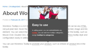
The wordpress tooltip glossary looks like this:


Leave a Reply